
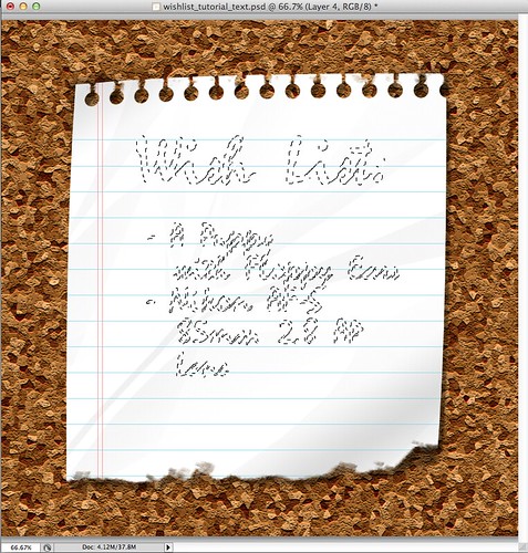
Today will be part two of last week's Tutorial Times: Wish Listing Paper Effects. That post included instructions to produce a torn page from a spiral-ring notepad in Photoshop. To complete the wish list, today I'll show you how to construct a corkboard background, and how to make your own brush to make text look like it was written with a pencil. Next week, I'll give some 3D effect to your piece of paper through shadows, crumples, and curled corners, because this post took forever to document and write. Here we go:
Pencil Writing
As always when manipulating text, an easy fix is to just download a text with that special cracked texture. But there are other options. It just takes time. And layers. And your left leg. (Is it obvious that I prefer the easy download-fix?) PS - You also either have to download a new brush set, or make your own.
'Nother little hint - the graphic I provided in last week's blog was a half-assed Add Noise effect. This one is the real deal. Pinky Promise.
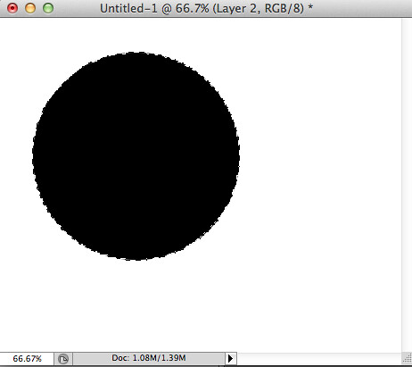
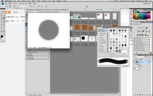
Open a new document. It doesn't need to be big. Fill the back with white and add a new layer, draw a perfect ellipse (hold down shift while you drag out the shape), and fill the ellipse with black.
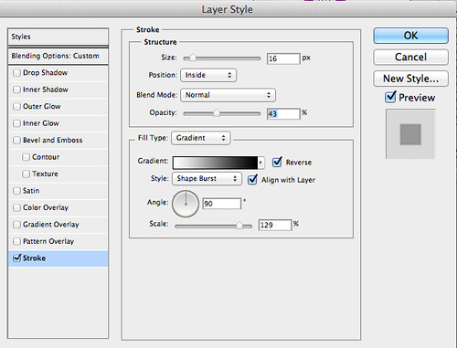
In layer properties (right-click or cntrl-click on the layer), and bring down the opacity to about 50%.
Now, add a gradient stroke. I'll show you my settings, but you might have to play with the sizes a bit. Use that ingenuity I know you've got somewhere in there!
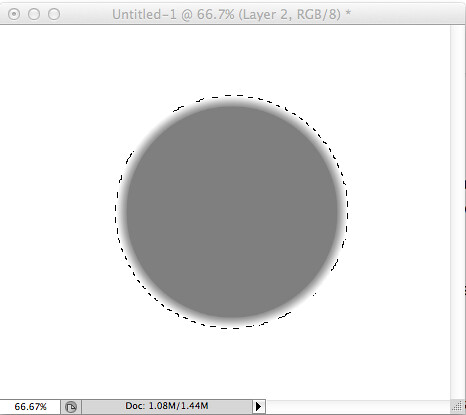 |
| It should look like this now, or something close to it. |
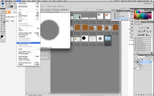
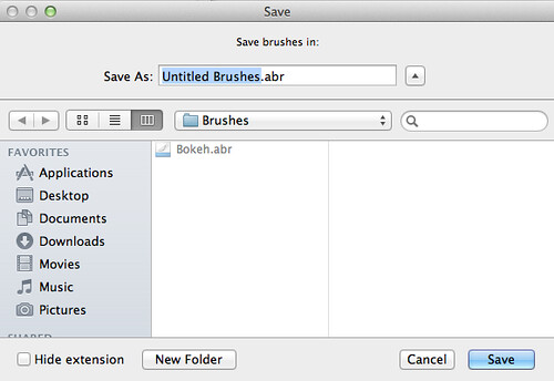
Now go to Edit>Define Brush Preset.
You'll have to have the brush tool selected to edit the preset, but once you do, open your brushes window (I always have it on a toolbar to the right), make sure the brush you just created is selected (it'll be all the way at the bottom), and start editing your brush preset.
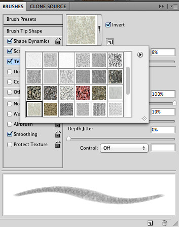
There may be some variations from my settings, but the important parts are that you have Pen Pressure under Shape Dynamics on, that you have a texture selected (I used an inverted Textured Tile from Artist Surfaces), and a Dual Brush selected that has uneven edges (like charcoal or wax crayon).
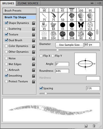 |
| I make my brush angled as a pro-active approach for if I ever try to draw free-hand with the brush. Also, play with the spacing to find an overlap you feel comfortable with. |
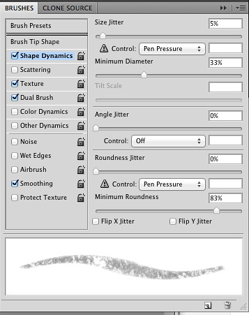 |
| To randomize the effects, I put a touch of size jitter into the mix. This means you're clicking and dragging the brush, the brush size will randomize ever so slightly to give you a more realistic, human-error effect. Also, make sure the Control under Roundness Jitter and under Size Jitter is set to Pen Pressure. |
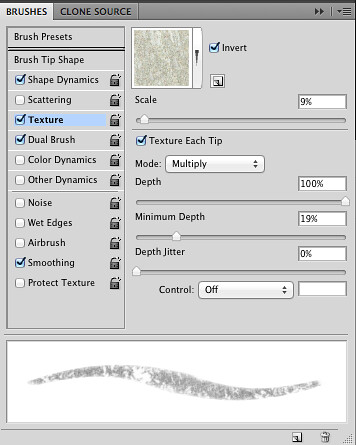 |
| Adding texture is super important to give some depth. I fished for a while the first time I created a Pencil Brush. Feel free to play and find something you feel presents that pencil-effect perfectly. I picked a textured tile. |
 |
| What the textured tile looks like without the dual brush. Still pretty nice, right? |
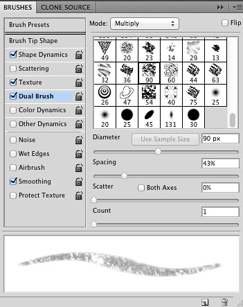 |
| The Dual Brush gives the last kick you need to make the edges a little less predictable. Plus that nice splotch in the middle will come in handy. |
 |
| As you can see, I haven't converted all of the brushes I created on my other computer over here yet. |
The last step in the Designer Digitals tutorial is to paint in the brush (they called it "stamping" which I find confusing.) It's painting. Since just the letters are selected, it act's as a sort of cut-out, and only the letters will be painted.
You want to be careful with how you paint it in, since it's a pretty lightly colored brush. Make sure your opacity is cranked all the way up, and downsize your brush so it's just barely bigger than the thickness of your font. Since my font is cursive, I carefully brushed up and down, sort of roughly following the text as if I was writing it myself.
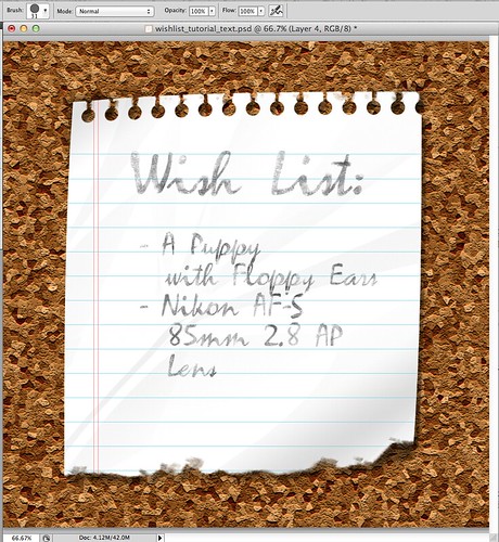
I thought it was a bit too light, so I duplicated the layer over the top to make it a touch darker.
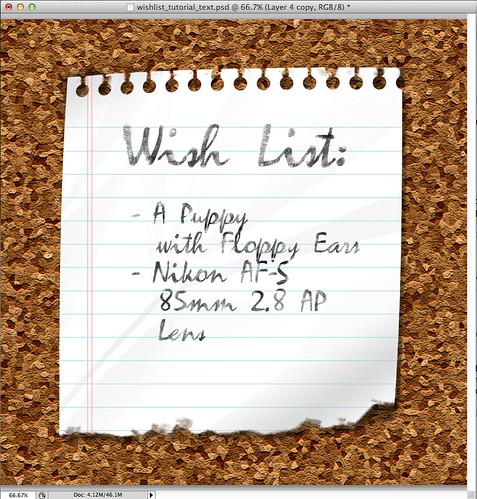
There you are!
Corkboard Backdrop
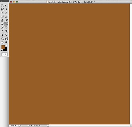
Again, there's a million ways to do this, and I know several of them, but this one is the easiest and fastest. Set your foreground to a medium brown, and fill the background layer with it.
With the background layer selected, go to Filter>Texture>Texturize. Now add some sandstone texture. You're gonna have to eyeball the depth since it varies depending on how big the image is. Here's mine.
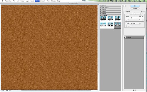
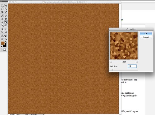
This step gives Photoshop a little variance in shadowing to work with. Go to Filter>Pixellate>Crystallize to make your differing cells. Your size is going to differ, and it's up to you. I used about 20.
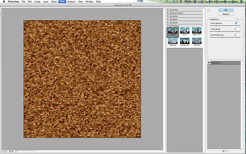
Now go to Filter>Texture>Craqelure. Same concept, differing effects. Eyeball it.
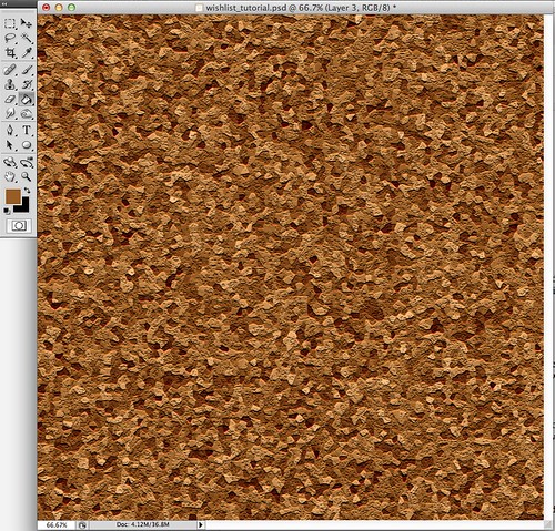
Now you have the shadows and cracks that are natural in a corkboard.
That should be enough to keep you occupied until next week's Tutorial Times. Also, I have made a deal with Mother Nature to let me go frollicking in a swamp at sunrise tomorrow, so hopefully she'll keep her side of the deal and will take this rain and cloudy crap away by then. Fingers crossed!
Sources: Designer Digitals - Filling text with Brushes in Photoshop
No comments:
Post a Comment